01
Brief
A home for furniture
that feels like home.
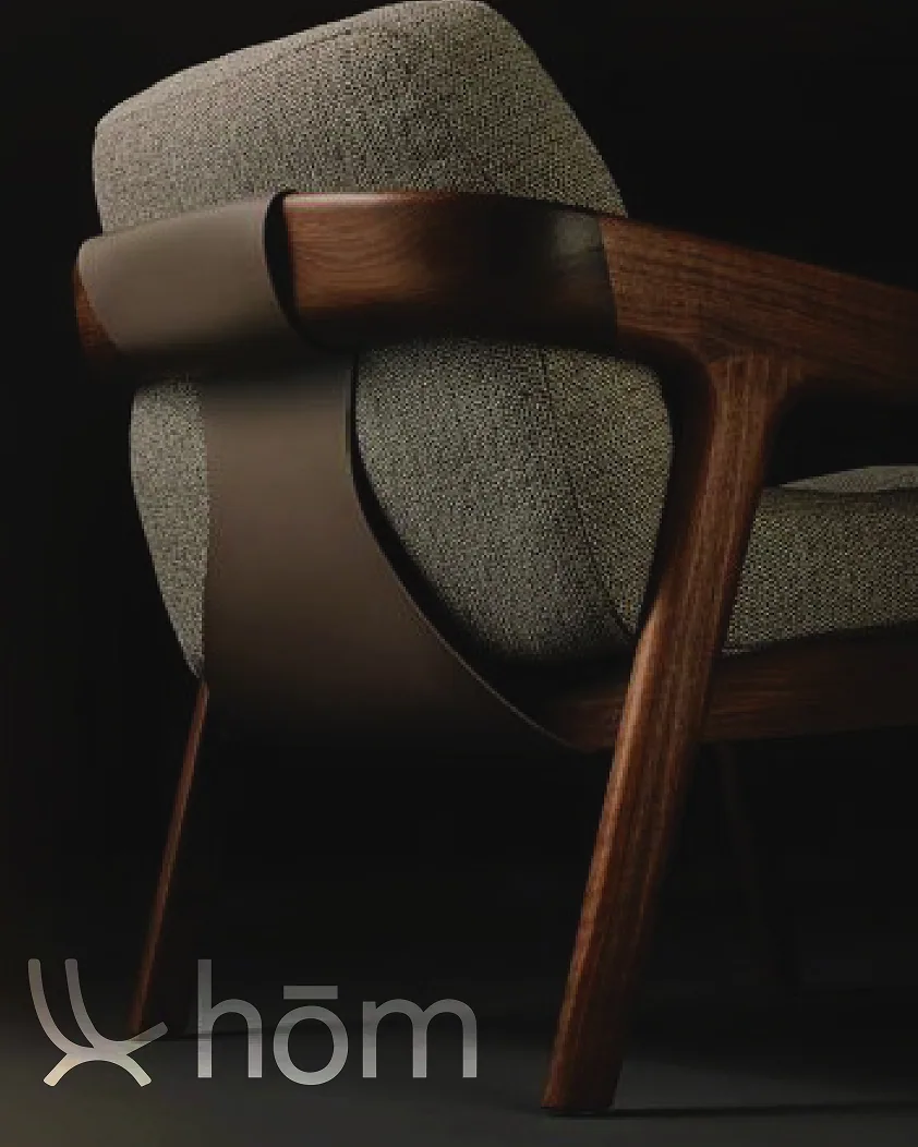
HOM Furniture sells considered pieces for the bedroom, the living room and the dining table. KHP was asked to build a brand that could hold that range together and speak to customers who buy furniture for how it feels, not only for how it looks.
02
The Challenge
Premium without
the noise.
Furniture retail is crowded with loud promotions and interchangeable logos. HOM needed an identity that read as premium and trustworthy at a glance, and stayed quiet enough to let the product lead on every surface it touches.
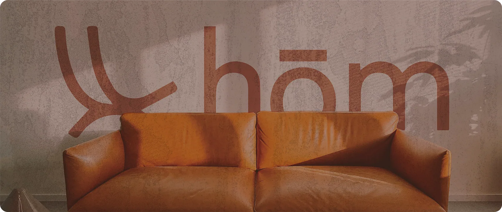
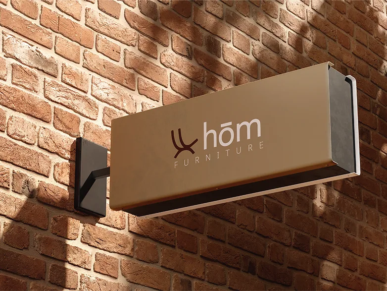
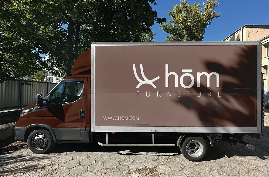
It also had to travel: from a showroom sign on brick to packaging in a warehouse, a business card on a desk and the side of a delivery truck (one system, recognisable at any scale).
03
Our Approach
Natural materials,
a disciplined system.
Step 01 - Mark & Brand Words
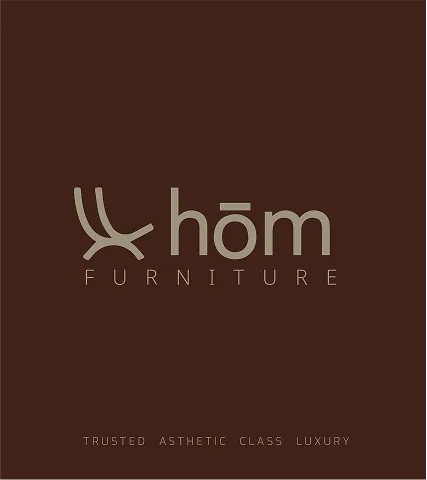
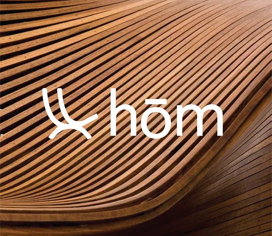
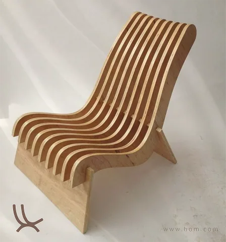
We drew an arched mark from the curve of a chair's frame and set it beside a light lowercase wordmark. Four words (Trusted, Asthetic, Class, Luxury) became the brand's voice and the frame for everything that followed.
Step 02 - Colour Palette & Mood
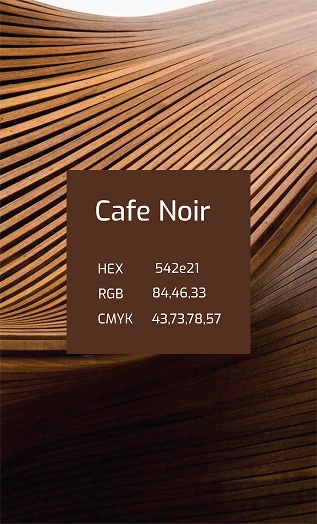
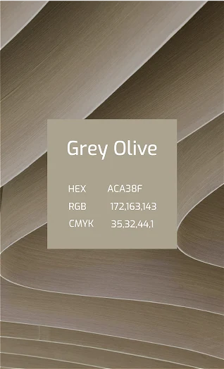
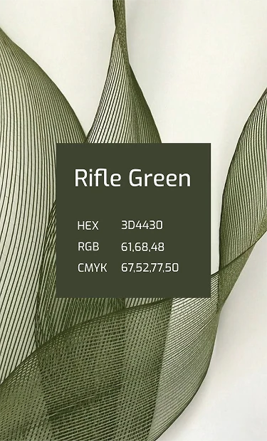
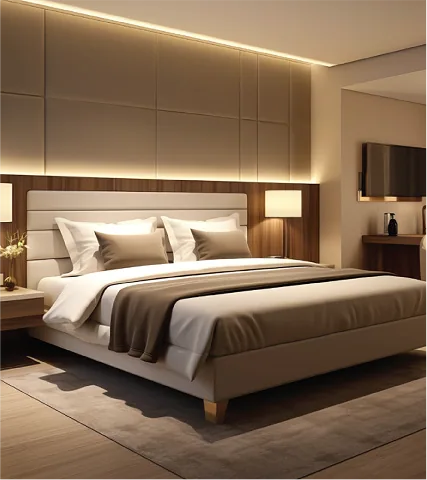
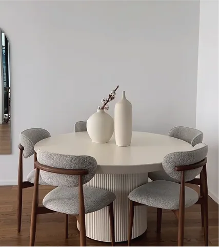
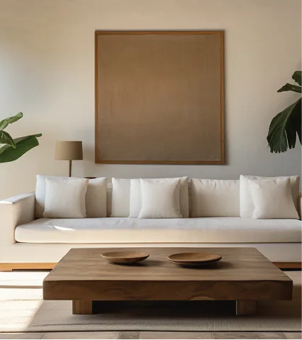
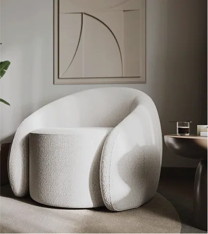
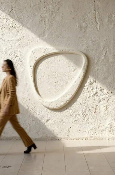
The palette comes straight from the material: Grey Olive #ACA38F, Rifle Green #3D4430 and Cafe Noir #542E21 (stone, leaf and leather). A mood board of warm, uncluttered interiors set the photographic direction.
Step 03 - Applied Identity
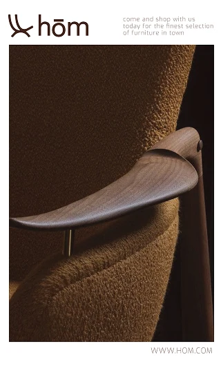
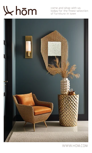
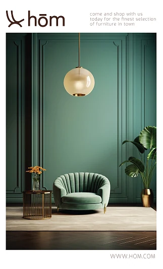
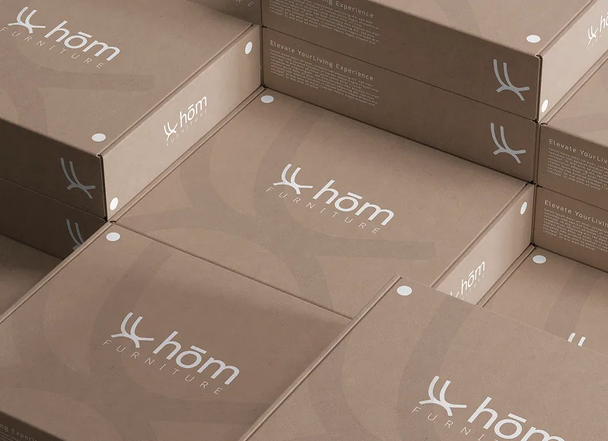
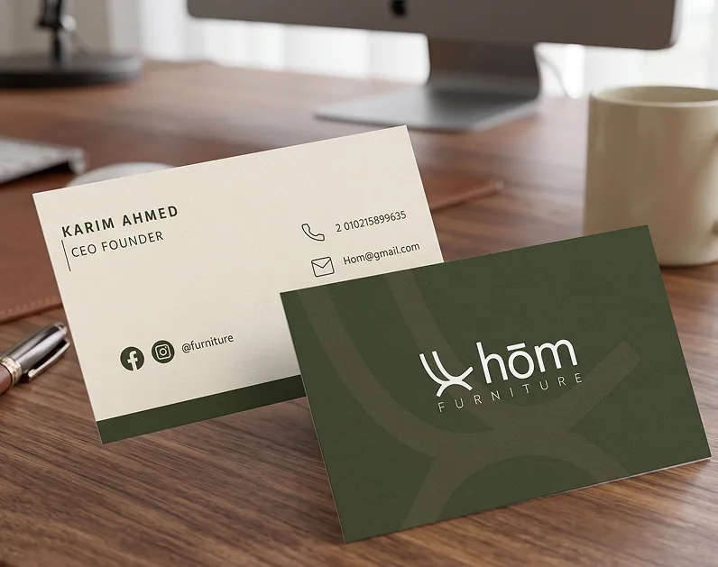
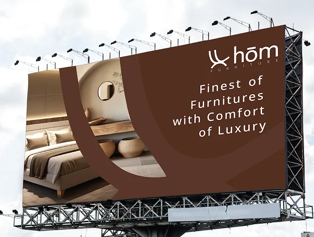
The system was carried onto branded packaging, business cards, outdoor billboards, the showroom sign and the delivery fleet, so the brand the customer meets in store is the one that arrives at their door.
04
The Result
From a furniture store
to a recognisable house.
HOM Furniture now carries one quiet, premium identity from the showroom wall to the delivery truck: a single mark, a three-colour palette drawn from wood, leaf and leather, and a set of applications that make every box, card and sign read as the same house.